Paper Therapy challenge - no stamps allowed

Comments Off on Paper Therapy challenge – no stamps allowed
Nov 102011

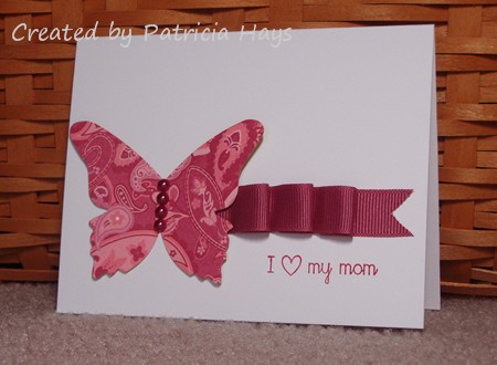
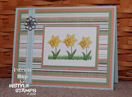
Good morning! It’s the 10th of the month, which means it’s time for a new Paper Therapy challenge. This time the Design Team is asking you to create a project without using any stamps.  You can create a card, a scrapbooking layout, a 3-D item, whatever you wish – but you cannot use stamped images on it.

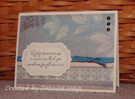
The card I created for this challenge is a bit unusual for me in a few ways.  First off, it’s a one-layer card.  I don’t make too many of them.  Secondly, because I decided to make it an “I love you” card for Operation Write Home, I chose to use pink cardstock.  Um, let’s rephrase that… *bright* pink cardstock.  Definitely NOT a color I use often.  Not using stamps was different too, but I have lots of rub ons to choose from so that didn’t pose a problem.  It’s also rare for me to tie a bow directly on a card, but I managed to get this one looking pretty decent.

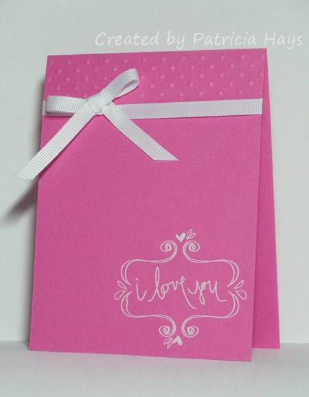
The embossing folder is a narrow one that came in a set of 5 different designs.  I felt like I had to use the ribbon to hide the edge line it made.

As many rub ons as I have from various companies, I should use them more often when I need a quick card.  The one on this card came from a Close To My Heart set that I received a while back as blog candy.  It’s the first time I’ve tried using any CTMH products.  I have to say that this was the most difficult rub on I’ve ever used because it kept curling up on me while I was transferring the design.  You can see in the left corner of it how the curve didn’t match up exactly right.  Oops.  I think when I use another one from this set, I’m going to try using a temporary adhesive to stick it down to the cardstock before I start transferring.

So anyway, now it’s time for you to get crafting!  Be sure to share your projects made without stamps on the November 10 challenge thread over at Paper Therapy.  The deadline for posting is December 8, 2011.  We hope you’ll join us!

Supplies for today’s card:
Cardstock: Pixie Pink (Stampin’ Up)
Other: White Daisy rub ons (Close To My Heart); Just My Type embossing folder (Cuttlebug); white grosgrain ribbon (SU)

Hi! Sorry I’ve been somewhat missing in action this week. I’ve been busy creating cards for the World Card Making Day challenges that were presented over at Paper Therapy.

I combined several challenges for this card.  One challenge was to use the color blue.  Ok, I used three different shades.  One was to create a monochromatic card.  My three shades of blue accomplished that.  One was to create a card using no designer papers.  You won’t find any on this card.  And a fourth challenge was to create a card using scraps.  The card base was a half-sheet I found in my folder of Baja Breeze cardstock.  The heat embossed snowman piece was a leftover from the Christmas cards I sent in 2007.  I added the dry embossed snowflakes to the light blue strip tonight, but that strip was also a scrap from my 2007 Christmas cards.  I considered adding a sentiment, but then decided against it.  I figure this way it’s a good wintery any occasion card to donate to Operation Write Home.  It’s kind of plain and simple, but it’ll be easy to mail that way.

The big project of the week was creating a “one sheet wonder” – making as many cards as possible using one 12″ x 12″ sheet of designer paper to embellish the cards.  I ended up creating 15 cards from my designer paper.  This collection is going to be divided between Operation Write Home and Hope You Can Cling To.

I’ll take individual photos of them and share them soon, along with a template for how I cut the cardstock.  Only two of the cards are very similar, and I think they just might be my favorites of the group.  Here’s a picture of them side by side.  I used them for the Paper Therapy challenge to use a punch in creating a card.

So, all of that is what’s been keeping me busy.  I hope you’ve been having a good creative week too!

It’s time for another Paper Therapy Design Team challenge!  Today we’re asking you to use metal embellishments on your project.  Use a little or a lot – it’s up to you and it’s all good.  Just be sure to share your project in the September 9 thread on the Paper Therapy challenge forum by October 8, 2011.

Here’s what I created for the challenge.  The flower centers are brads, and a small frame highlights the sentiment.   I also worked several of the current Desert Island Crafts Challenge itinerary items into this card – flowers, nature inspired, a sentiment, a little bit of green, and dimension.  And I don’t think it’s too lumpy for Operation Write Home.

Supplies:
Stamps: Artfully Asian (Stampin’ Up); Tag Lines (Gina K. Designs)
Cardstock: Confetti White, More Mustard (SU)
Ink: Always Artichoke (SU)
Other: Always Artichoke marker, blender pen, Hodgepodge Hardware, dimensionals (SU); flowers (Prima)

Happy Friday!  It’s time for another Paper Therapy Design Team challenge!  This time the challenge is to make a project suitable for a child under the age of 10.

I decided to make a Halloween card.  I was just kind of feeling a Halloween mood, I suppose.  I’m trying to get better at coloring images and I really challenged myself on this one.  I had a hard time getting the shading the way I wanted it without losing all the wonderful detail in the image.  I’ve had this great sentiment for nearly a year and hadn’t had a good chance to put it to use until now.  It reads, “When witches go riding, and black cats are seen, the moon laughs and whispers, ’til near Halloween.”  I thought the image and the sentiment went together very nicely. The background diamonds were stamped off once, but I still managed to get them darker right where I wanted to put the sentiment. Sigh. Oh well!

Here’s a closeup of the image:

So, won’t you join us at Paper Therapy?  We’d love to see what you create!

Supplies for today’s card:
Stamps: harlequin design: Looks Like Spring (Stampin’ Up); sentiment : Sweet & Spooky (Lizzie Anne Designs)
Digital Image: Halloween Witch (Mo’s Digital Pencil)
Cardstock: Vintage Cream (Papertrey Ink); Basic Black (SU)
Ink: Crumb Cake (SU); Onyx Black (VersaFine); printer ink
Other: black gingham ribbon (SU); Premier colored pencils (Prismacolor)

Happy Friday!  It’s time for another Paper Therapy Design Team challenge.  This time, the challenge is to make a card with a fold other than the standard 4.25″ x 5.5″ card fold.

I combined this challenge with this week’s Splitcoaststampers Clean and Simple sketch challenge, and made a flap card.  I started out with a 5.5″ x 11″ piece of white cardstock, scored at 4.25″ and 8.5″.  I wanted to shape the smallest section (the flap) with my Creative Memories Oval cutting system, but the ovals didn’t fit quite right so I had to cut the cardstock down to 5″ x 11″.  Then I trimmed the flap to give it the rounded shape.  I sponged the sky and grass, stamped the tree, and used the thumping technique to stamp the leaves.  Then I added the sentiment.  Finally, I attached a set of very thin magnets to keep the card closed.

There it is… clean and simple but with an interesting fold!  I hope you’ll visit the rest of the Paper Therapy design team for more inspiration – links to their blogs are in the left sidebar.  Then make a card with a non-standard fold and upload it to the August 12 challenge thread over at Paper Therapy before August 24.  We’d love to see what you create!

Supplies:
Stamps: Season of Friendship, Three Little Words (Stampin’ Up)
Cardstock: Basics White (Papertrey Ink)
Ink: Soft Sky, Certainly Celery, Close to Cocoa (SU)
Other: Summer Sun and Pumpkin Pie markers (SU); magnets (Basic Grey); oval cutting system (Creative Memories); sponge

Because we have an “extra” Friday this month, the Paper Therapy Design Team is throwing out another challenge!  This time, we’d like to see you make a card or scrapbooking layout showcasing your favorite holiday.  That’s not too difficult, right?  😉  Be sure to upload your project to the Paper Therapy challenge forum thread for July 29.

I love the happiness and wonder of the Christmas season so I decided to make a Christmas card.  I wanted to start on some Christmas cards for Operation Write Home anyway, so I went with a design that would be easy to mail.  I originally intended to use a “Merry Christmas” stamp for the sentiment, but I felt that this one filled the space on the card better than any of my other holiday sentiments.  I also like that the script “holidays” kind of coordinates with the swirls behind the poinsettia.

Supplies:
Stamps: Season of Joy (Stampin’ Up); Seasonal Sayings (Gina K. Designs)
Cardstock: Cherry Cobbler, Garden Green, Whisper White (SU)
Ink: Cherry Cobbler, Garden Green (SU)
Other: 5-Petal Flower punch (SU)

The first time I saw the sentiment that I used on today’s card, I knew I had to buy the stamp.  I thought it would be a fun way to tease some of my older friends about their age and forgetfulness.

Today’s card is going to one of those friends, but I also created it for the current Paper Therapy Design Team challenge.  This time we have a recipe challenge – your project must contain two designer papers, ribbon or twine, bling, distressing, and the color blue.  I decided using designer paper with blue in it would be an easy way to incorporate those elements.  I added a little sponging to the sentiment panel before I lightly distressed the edges of it. I have to admit that the bling requirement threw me off at first.  I tend to think of rhinestones and sparkly stuff when I hear the word “bling”.  Then I remembered I had these dark half pearls and they worked with the dark colors in the designer papers I’d chosen.  The ribbon is a bit brighter than I’d like to go next to the leafy designer paper, but if you look carefully at the striped part of the paper at the bottom, the ribbon is a good match to the blue in it.

So come on and join us in the Paper Therapy challenge!  We’d love to see your work.  Just upload it to the July 22 challenge thread in the Paper Therapy forums by August 3.

Supplies:
Stamps: Ageless (Lizzie Anne Designs)
Cardstock: Confetti Cream (Stampin’ Up); designer papers from Memoirs 6″ x 6″ paper pad (Inque Boutique)
Ink: Chocolate Chip (SU)
Other: ribbon (Really Reasonable Ribbon); half pearls (KaiserCraft); Labels 4 Nestabilities die (Spellbinders)

It’s time for another Paper Therapy Design Team challenge!  Today’s challenge is to use a sketch for the layout of your project.  You can find sketches at a myriad of sites online, or you can use one from a cardmaking magazine.  It’s up to you!  Just post your card and your sketch (or at least a link to the sketch) to the Paper Therapy challenges forum thread for the July 8 challenge by July 20. I hope you’ll join us!

Anyone who has read my blog from time to time should already know that I *love* sketch challenges!  I think they are easiest for me because I don’t have to worry about the composition of the layout elements.  I just have to choose colors and images to fit the sketch.  For the Paper Therapy challenge, I chose sketch #75 from the OWH Stars and Stamps blog.  I didn’t have a chance to try the sketch when it was first introduced, but I liked the looks of it too much to just let it pass by.  I also combined this challenge with one of the Splitcoaststampers CAS July 4th holiday challenges, to create a monochromatic card using either all white, shades of red, or shades of blue.  I decided to use some of my all-time favorite Stampin’ Up blues, Soft Sky and Blue Bayou.  And here’s what I created:

Supplies:
Stamps: Wavy Wishes (Hero Arts)
Cardstock: Basics White (Papertrey Ink); Soft Sky Prints designer series paper (Stampin’ Up)
Ink: Blue Bayou (SU)
Other: Blue Bayou ribbon (SU); sponge

birthday balloons

Comments Off on birthday balloons
Jun 242011

Good morning!  It’s the fourth Friday of the month – which means it’s time for another Paper Therapy Design Team challenge!  This time, because Canada Day and Independence Day are quickly approaching, the challenge is to use red, white, and/or blue in your project.  That’s pretty easy, right?  Be sure to share your project in the Paper Therapy challenge forum by July 6 to be considered for a prize!

I did a little fudging with my project so that it would also work for a couple of this week’s challenges at Splitcoaststampers.  The CAS challenge is to make a tall, narrow card.  I kept mine the standard 5.5″ height but cut the width down to 3.5″.  I wanted my card to be able to fit into a standard envelope for Operation Write Home.  The color challenge is for the colors Cherry Cobbler, Night of Navy, and Crumb Cake.  That gave me variations on the usual patriotic red and blue.  I added white with the twine and by stamping the balloons onto white cardstock before cutting them out and adhering them to the card. The cherry one is attached with dimensional adhesive.

There’s a reason why I decided to make a birthday card rather than something overtly patriotic.  Both of my grandfathers were born on the 4th of July.  Although they were both born in Europe and emigrated to the United States with their families while they were children, they embraced their new country as their home.  My childhood memories of 4th of July celebrations are of birthday parties for them, as well as for the United States.  Sadly, both of my grandfathers are deceased now, but there hasn’t been an Independence Day that I haven’t thought of them and how brave their parents were to start a new life here in Virginia, not knowing for certain what they’d face when they arrived here.

Supplies:
Stamps: Birthday Whimsy (Stampin’ Up)
Cardstock: Crumb Cake, Whisper White (SU)
Ink: Cherry Cobbler, Night of Navy
Other: dimensionals (SU); twine (Really Reasonable Ribbon)

Hi everyone!  Are you ready for another Paper Therapy Design Team challenge?  This time we have an inspiration challenge:  find an ad and let it be the inspiration for your creation. You have until June 8 to share your challenge project at the Paper Therapy website.

I fudged the “ad” part a little bitty bit.  I don’t have any recent magazines here to browse through for ads, so I did some web surfing to search for my inspiration photo.  I found this one:

As soon as I saw it, it reminded me of my Basic Grey Ambrosia papers.  I pulled out that paper pad and sure enough, the colors of several of the papers coordinated perfectly with the colors in this photo.  I liked the gentle curves in the photo too.  I didn’t replicate them exactly, but I did use some rounded elements in my card’s layout, which is this month’s Sketch For You To Try.  I just received this Lawn Fawn stamp set yesterday and it’s *so* adorable, I couldn’t wait to use it.  So, here’s my card:

I’m planning to send this one to Operation Write Home.  Don’t you think it’ll make someone’s day brighter when their favorite military member stationed overseas sends it home?

Supplies:
Stamps: My Silly Valentine (Lawn Fawn)
Cardstock: Marigold Morning, Naturals White (Stampin’ Up); Marmalade, Chutney and Smoke papers from Ambrosia 6″ x 6″ paper pad (Basic Grey)
Ink: Onyx Black (VersaFine)
Other: Premier colored pencils (Prismacolor); odorless mineral spirits (Houston Arts)

At the risk of bogging this post down with graphics, here’s the original sketch:

Remember how I said a few days ago not to be surprised if you see me use the OWH Stars & Stamps sketch #68 layout again?

I let this week’s Paper Therapy Design Team challenge sneak up on me and remembered just in the nick of time that I needed to make a card for it.  This time it’s a color challenge – bright yellow, pink and blue with a neutral.  I also needed a birthday card for a family friend.  So I combined the colors with the sketch and some stamps that hadn’t seen ink for a while, and about 25 minutes later I ended up with this:

Even though the flowers are from two different stamp sets, I think they coordinate pretty well.  The large flower was stamped on a scrap piece of cardstock and then cut out.  Looking at it as I’m writing this post, before I mail this card I think I’m going to try curling the petals a bit to give that flower a little extra dimension.  The bright colors seem fitting for our friend’s bright, bubbly personality.

Go check out what the other Paper Therapy DT members have made  – links to their blogs are over in the left sidebar.  Then make something and share it over on the Paper Therapy website.  We’d love to have you join in our challenge!

All supplies for today’s card are from Stampin’ Up.
Stamps: Bitty Basics, Petal Prints, On Your Birthday
Cardstock: Daffodil Delight, Pacific Point, Melon Mambo, Whisper White
Ink: Daffodil Delight, Pacific Point, Melon Mambo

When the Paper Therapy Design Team chose to change our challenge schedule to the 2nd and 4th Fridays of the month, with the Paper Therapy Mix It Up Challenges running on the 1st and 3rd Fridays, we realized that because a few months had 5 Fridays, there would be some Fridays without challenges.  The Design Team didn’t like that.  So we decided that we’d offer “Freaky Friday” challenges on those “extra” Fridays.  Today marks the first of them.

This week the challenge is to “CASE” (Copy And Selectively Edit) a project made by another Paper Therapy member.  Ashlee T‘s typically clean and simple style is right up my alley, and I decided to choose her card from her March 16, 2011 blog post as my project.  I had to use slightly different shades of green and orange because I don’t have designer papers in the exact colors Ashlee used.  I could have used a polka dotted paper like she used, but I didn’t want my card to be an exact duplicate, so I chose a fine pindot stripe instead.  I also used a different stamp set, and I modified her layout from a square card to a rectangular one.  I wanted to elevate the green present just slightly from the two orange ones.  A dimensional adhesive, such as a pop dot, would have given it more height than I wanted.  So I took a scrap of white cardstock, cut two narrow pieces from it, stacked them, and adhered them to the bottom of the present.

Thank you, Ashlee, for the inspiration!  🙂

All supplies for today’s card are from Stampin’ Up unless otherwise indicated.
Stamps: Birthday Whimsy
Cardstock: Sahara Sand, Pumpkin Pie, Whisper White, Certainly Celery Prints designer paper, Baja Breeze designer paper
Ink: Certainly Celery, Pumpkin Pie
Other: corner rounder punch; distressing tool (Making Memories)

Hello!  It’s time for the all-new second round of Paper Therapy Design Team challenges!  This time, a new challenge will be presented on the second and fourth Friday of each month.  If you’d like to participate in the challenge, you then have two weeks to create something and post a photo of it in the Paper Therapy challenge forum. Participants will have their names entered into a prize drawing at the end of the month, making them eligible to win some fun crafting goodies!

Since Easter is quickly approaching, today’s challenge is for you to use a basket on your project.  I decided to use one of my retired Stampin’ Up stamp sets for this.  I stamped the basket and the flowers separately on Whisper White cardstock, fussy cut both images after coloring them, and used dimensional adhesive to let the flowers pop up a bit over the edge of the basket.  The layout is inspired by this week’s Operation Write Home sketch challenge.  Because of the way the flowers were arranged on the designer paper I used, I had to use a mirror image of the original sketch.  I also took the liberty of adding a few layers to help bring out the colors in the designer paper.

I hope you’ll give my fellow Paper Therapy Design Team members some love by commenting on their blogs, and I hope you’ll play along and share your own creations with us!

Supplies for today’s card:
Stamps: Basket Full of Fun (Stampin’ Up)
Cardstock: Crumb Cake, Marina Mist (SU); designer paper from “Memoirs” 6″ x 6″ paper pad (Inque Boutique)
Ink: Onyx Black (VersaFine)
Other: grosgrain ribbon (Really Reasonable Ribbon); Premier colored pencils (Prismacolor); odorless mineral spirits (Houston Arts); standard circle and big scalloped circle Nestabilities dies (Spellbinders)

Hello! Welcome to the last week of March! Here’s hoping we finally get some warmer weather in April.

Today brings the last of the weekly Paper Therapy Design Team challenges. Starting April 1, the Design Team challenges will move to a bi-weekly format. A new challenge will be posted every other Friday, alternating with the Paper Therapy Mix it Up challenges. That means a new challenge will be posted at Paper Therapy every Friday, but you will have two weeks to complete each challenge!  I’m looking forward to the new format and I hope my readers will be able to join in more of the challenges.

This week, our challenge is to make a card with a bug on it.  I couldn’t decide whether a butterfly counted as a “bug”, since they are so pretty and elegant!  So I made two cards – one with a butterfly and one with a bug.  Both cards will be shipped to Operation Write Home either today or tomorrow along with the other cards I’ve been making for OWH since Christmas.

The OWH Midweek Challenge last week was to create a card that a hero could send home to a child.  I decided to pair this cute ladybug stamp with some bright colors.  I’ve had this polka dot paper for a LONG time and it feels good to be putting it to use. The Midweek Challenge the week before was to use scallops, and you may be able to see some peeking out around the circle that the bug is on.  (I should have made that mat a bit larger.  Oh well.)

I keep reading that OWH still needs Mother’s Day cards, so I made a few extra to include in my shipment to them.  My second card is one of those.  It’s pretty clean and simple.  Just in case it doesn’t make it to the troops in time for them to send back home for Mother’s Day, I went with a non-holiday sentiment. I came upon this ribbon by a stroke of pure luck.  I recently received an order from Really Reasonable Ribbon and they had wrapped it around the plastic bag containing my things.  It just happened to coordinate excellently with this designer paper!  The butterfly is attached only at the middle, to give some dimension.

And now that I’ve gotten the bugs out of my system (LOL) I hope to have more cards to share with you in the next few weeks.  I hate that I haven’t been posting as much the last couple of weeks!

Here are the supply lists for today’s cards.

Ladybug card:
Stamps: Petite Phrases, Everyday Sayings (Lizzie Anne Designs)
Cardstock: Real Red, Basic Black, Whisper White (Stampin’ Up); polka dot paper (Creative Memories)
Ink: Onyx Black (VersaFine)
Other: markers (Copic); standard circle and big scalloped circle Nestabilities dies (Spellbinders)

Butterfly card:
Stamp: It’s Good to Be Queen (LAD)
Cardstock: Basics White (Papertrey Ink); Raspberry Tart designer paper (SU)
Ink: Rose Red (SU)
Other: Beautiful Butterflies die (SU); grosgrain ribbon (Really Reasonable Ribbon); half pearls (KaiserCraft)

I’ve seen some daffodils blooming in my area, although the ones in my flower border haven’t opened yet.  So the flowers on today’s card will just have to suffice for making today feel like Spring has finally arrived.

Today’s card uses this week’s Paper Therapy sketch challenge layout and this month’s InStyle Stamps color combination.  The color combo allowed me to use some of my retired Stampin’ Up products.  For the focal panel, I used the daffodil image from Patty Bunny Wuv and repeated it twice.  Patty Bunny Wuv is available at the InStyle Stamps store as a set of unmounted rubber stamps, but as a design team member, I was able to get this one image in digital format. That allowed me to tweak it a bit – my daffodils are just slightly different sizes, since in nature they wouldn’t all be exactly alike, know what I mean? I apologize if that throws anybody off if they’re interested in purchasing this stamp set. In retrospect I probably shouldn’t have tweaked. Sigh… that’s part of the fun of digi images, though! Anyway… I colored the flowers with Copic markers.  I decided to show off my totally awesome drawing skills (LOL!) by adding some grass to ground the daffodils, so they wouldn’t look like they were just floating around.

And now I have another card for Operation Write Home!

So, here is the card:

And here is the supply list:
Image: daffodil from Patty Bunny Wuv (InStyle Stamps)
Cardstock: Soft Sky, Groovy Guava, Wild Wasabi, Afternoon Tea designer paper (Stampin’ Up); Basics White (Papertrey Ink)
Other: markers (Copic); Soft Sky ribbon, filigree brad (SU)


In the spirit of full disclosure, the image used on today’s project was provided to me by InStyle Stamps to aid in promoting their products.

© 2019 Suffusion theme by Sayontan Sinha