I’ll admit it: even though I love crafting challenges, the inspiration challenges – where you are assigned a photo from which to draw inspiration for your creation – tend to be the most difficult for me.  I can’t really explain why that’s so.  I guess I feel a little overwhelmed by the choices – do I use the colors, or something from the layout, or does the photo remind me of something?

That wasn’t the case with this month’s InStyle Stamps Inspiration Challenge.  When I saw the inspiration photo, I knew right away that I wanted to use the yummy colors with this cupcake image.  I tweaked the OWH Stars & Stamps sketch #63 for the layout by rotating the card 90°, widening the image panel, and shifting the panel and the embellishment to the center of the card. Here’s my finished creation:

I dug out my bottle of Crystal Lacquer and added some to the dome to make it look more like glass. I haven’t used that stuff in a long time and it was pretty thick, so I had to use a paintbrush to apply it to the image.

Oh, here’s the inspiration photo:

This week’s OWH Stars & Stamps Midweek Throwdown is to make an Any Hero card – one with a note of appreciation and encouragement that would be delivered to a service member overseas to pick up his or her spirits.  I think if I can get over my shyness about what to write in an Any Hero card, I’m going to use this card for that purpose in my next shipment to Operation Write Home.

The supply list for today’s card:
Stamps: Tia’s Appreciation (InStyle Stamps)
Cardstock: Marina Mist (Stampin’ Up); Basics White (Papertrey Ink); designer paper from Cabana 6″ x 6″ paper pad (Inque Boutique)
Ink: printer ink
Other: markers (Copic); Crystal Lacquer (Sakura); Buttercup grosgrain ribbon (Really Reasonable Ribbon)


In the spirit of full disclosure, the image used on today’s project was provided to me by InStyle Stamps to aid in promoting their products.

Happy Thursday!  The weekend is almost here, hooray!  It’s hard to believe April is about halfway over already.

Today’s card was made with three challenges in mind.  I used the April InStyle Stamps sketch challenge for the layout and the April InStyle Stamps color challenge for the color scheme.  I also used the following elements from Desert Islands Crafters Challenge #5: ribbon, a birthday theme, a bow, dots, pearls, and bright colors.

Supplies:
Stamps: present from Patty’s Appreciation (InStyle Stamps); Friendly Greetings (Hero Arts)
Cardstock: Basics White (Papertrey Ink); Daffodil Delight, Chocolate Chip, Prints designer series paper (Stampin’ Up)
Ink: Chocolate Chip (SU); printer ink
Other: markers (Copic); Chocolate Chip grosgrain ribbon (SU); standard circles Nestabilities dies (Spellbinders); self-adhesive pearls (KaiserCraft)


In the spirit of full disclosure, the present image used on today’s project was provided to me by InStyle Stamps to aid in promoting their products.

This is just a quick post to remind you that it’s not too late to participate in the March color and sketch challenges at InStyle Stamps!  The deadline for submitting cards for the sketch challenge is Tuesday, April 5 at 11:59 pm PST.  You can submit a project for the color challenge until 11:59 pm PST Tuesday, April 12.  Use an InStyle Stamps image in your creations and you could win two free InStyle digital images of your choice!  Even if you don’t use an ISS image, you could still win one digital image of your choice.  Go for it and link your work to the respective posts on the InStyle Stamps blog.  I’d love to see what you can make!

Today’s card combines the sketch challenge and the color challenge.

Supplies:
Image: Tia & Cuddles He is Risen (InStyle Stamps)
Cardstock: Basics White (Papertrey Ink); Barely Banana textured, Spring Flowers designer paper (Stampin’ Up)
Other: markers (Copic); lacy circles Nestabilities die (Spellbinders)


In the spirit of full disclosure, the image used on today’s project was provided to me by InStyle Stamps to aid in promoting their products.

Hello!  Today I’m excited to be participating in my first InStyle Stamps Design Team blog hop!  Join us on the last Friday of every month for some great projects and inspiration!

I was put at the beginning of the hop.  There’s no pressure in going first, is there?  😉  Unless you’re one of my regular visitors, you should have come here directly from the InStyle Stamps company blog.  If you didn’t start there, you’ll want to check back to get all the fun details about this hop.

The blog hop theme this month is Springtime, and seeing the daffodils bloom is one sure way to let me know that Spring has arrived.  I decided to use the daffodil from the Patty Bunny Wuv set for my card.  I know, I’ve already used it several times this month, but I just really love this image!  It seems so cheerful to me.  I wanted to color it to try to look like my Smiling Sun daffodils, but I had to mute the yellow some so it wouldn’t clash with the designer paper and the cardstock I wanted to use.  I drew in the grass by hand so the flower wouldn’t just seem to be floating in space.  The card’s layout is a mirror image of this month’s InStyle Stamps sketch challenge layout.  I thought with the daffodil facing left, it looked better when I flipped the sketch. If you like the sketch, you have until 11:59 pm Pacific Time Tuesday, April 5 to enter the challenge for a chance to win at least one digital image from InStyle Stamps!  Click the link to the sketch challenge for more deets on that.  I decided to use a scalloped edge on the circular part of the sketch and add a bit of piercing to it.  I couldn’t decide on a sentiment to use, so I decided to leave it plain.  That way when I send the card to Operation Write Home, one of our military heroes can use it for any occasion.


Thanks for hopping with me today!  Here’s the rest of the blog hop lineup:

Angelique
Axa
Kimme
Sherry
Jennifer
Kerry
Virginia
Patty

Details for today’s card:
Image: daffodil from Patty Bunny Wuv (InStyle Stamps)
Cardstock: So Saffron, Tea Party designer paper (Stampin’ Up); Basics White (Papertrey Ink)
Ink: printer ink
Other: Premier colored pencils (Prismacolor); odorless mineral spirits (Houston Arts); paper piercing tool (Making Memories); petite scalloped circle Nestabilities die (Spellbinders)


In the spirit of full disclosure, the image used on today’s project was provided to me by InStyle Stamps to aid in promoting their products.

I’ve seen some daffodils blooming in my area, although the ones in my flower border haven’t opened yet.  So the flowers on today’s card will just have to suffice for making today feel like Spring has finally arrived.

Today’s card uses this week’s Paper Therapy sketch challenge layout and this month’s InStyle Stamps color combination.  The color combo allowed me to use some of my retired Stampin’ Up products.  For the focal panel, I used the daffodil image from Patty Bunny Wuv and repeated it twice.  Patty Bunny Wuv is available at the InStyle Stamps store as a set of unmounted rubber stamps, but as a design team member, I was able to get this one image in digital format. That allowed me to tweak it a bit – my daffodils are just slightly different sizes, since in nature they wouldn’t all be exactly alike, know what I mean? I apologize if that throws anybody off if they’re interested in purchasing this stamp set. In retrospect I probably shouldn’t have tweaked. Sigh… that’s part of the fun of digi images, though! Anyway… I colored the flowers with Copic markers.  I decided to show off my totally awesome drawing skills (LOL!) by adding some grass to ground the daffodils, so they wouldn’t look like they were just floating around.

And now I have another card for Operation Write Home!

So, here is the card:

And here is the supply list:
Image: daffodil from Patty Bunny Wuv (InStyle Stamps)
Cardstock: Soft Sky, Groovy Guava, Wild Wasabi, Afternoon Tea designer paper (Stampin’ Up); Basics White (Papertrey Ink)
Other: markers (Copic); Soft Sky ribbon, filigree brad (SU)


In the spirit of full disclosure, the image used on today’s project was provided to me by InStyle Stamps to aid in promoting their products.

Both of my sons really enjoy playing video games, whether it’s on the Xbox 360 or the Wii.  So when I saw this stamp at InStyle Stamps, I immediately wanted to get it to make cards for them. It looks so much like a younger version of my boys!

Today’s card is the birthday card I recently made for my older son.  I used the current In Style Stamps sketch challenge sketch, but changed it up from a horizontal layout to a vertical one.  I also used a diamond shape where the original sketch had a circle.  The color scheme came from a recent color challenge at Splitcoaststampers.com.

If you’re interested in participating in this sketch challenge, it’s not too late!  You have until 11:59 pm (Pacific time) March 1 to link your card to the sketch challenge post linked above on the InStyle Stamps blog.

Supplies:
Stamps: Ben (InStyle Stamps)
Cardstock: Daffodil Delight, Cajun Craze, Not Quite Navy (Stampin’ Up); Basics White (Papertrey Ink)
Ink: Onyx Black (VersaFine)
Other: markers (Copic); Happy Birthday embossing folder (ProvoCraft); diamond nesting dies (Dies Direct)

Hello!  Today I’ll be sharing the last of the Valentine-type projects I’ve made this year.  If you’re looking for the Virtual Valentine’s Day Blog Hop, you’ll want to click here: BLOG HOP post

Being on the InStyle Stamps design team has given me the chance recently to work with some really neat products from Plaid.  I received an assortment of Mod Podge glues, two colors of Extreme Glitter, Pop Dots and Mini Pop Dots.  Because I was feeling under the weather when I was working on these projects I didn’t get too adventuresome with the products, but hopefully soon I’ll be able to play with them some more.

Before I show you my projects, I want to talk about the Extreme Glitter.  I have to admit that for years I’ve stayed as far away from glitter as humanly possible.  I really despise the way it gets all over the place and sticks to everything and flakes off your project and you can’t get rid of it.  Well, Extreme Glitter is very different. It’s like a cross between a glue and a paint with lots of glitter mixed into it.  You simply brush it onto your project with a paint brush and let it dry. When I was just playing with the Extreme Glitter to try it out, I painted a reasonably thick (about 1/16″) coat of it on a scrap piece of cardstock. I gave it about an hour to dry, per the directions on the bottle.  Then I took my glittered scrap of cardstock and I rubbed my fingers over the glitter.  And I bent the cardstock.  And I cut into the painted part.   And the glitter seriously DID NOT FLAKE OFF!!!  I am SO impressed by that!  I thought, “WOW – this gives Operation Write Home cardmakers a way to use glitter safely on their cards!” (Glitter that flakes off onto our heroes’ clothing can be detected by night vision equipment, putting them at higher risk of danger – so glitter is generally a big no-no on OWH cards.)  I never thought I’d like glitter, but Extreme Glitter is helping me see it in a whole new light.

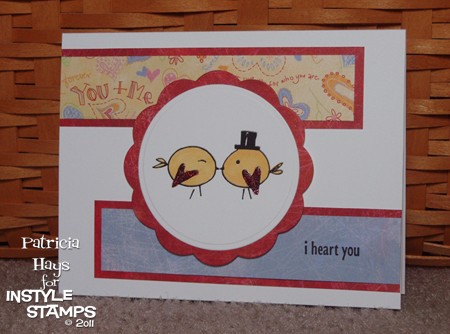
So now, here’s the card I made.  Because I plan to donate it to Operation Write Home and their Valentine’s Day deadline is long past, I wanted to keep it a kind of generic “love” theme.  The layout for the card is this month’s InStyle Stamps sketch challenge.  I used the InStyle Stamps Kissing Birds image.  Isn’t it adorable?  After I colored the birds with Copic markers, I painted their wings with red Extreme Glitter.  (I love that the wings are heart shaped.  TOO CUTE!) I added some designer papers from Basic Grey’s Sugar Rush 6″ x 6″ paper pad and a sentiment from Lizzie Anne Designs’ stamp set So Much Love.  The circle and scalloped circle were cut with Nestabilities dies and attached to the card with mini Pop Dots. I didn’t have a very good photography day so I don’t know how well you’ll be able to see the glitter in the photo.

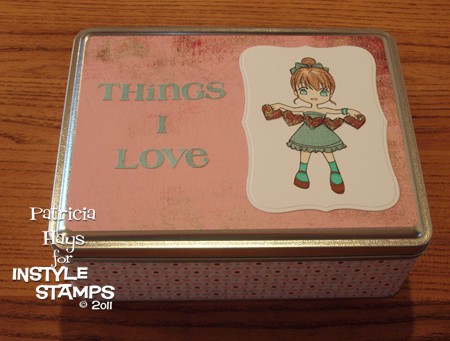
Next… Several months ago, I found an 8″ x 6″ rectangular tin on clearance at Michael’s for only $1.99 (the original price was something like $7.99).   I knew I’d be able to decorate it and put it to use some day – and the Plaid products gave me the opportunity to do it.  I decided to make it a kind of a treasure box to put special things in, like the birthday cards my sons give me.  I chose some papers from Basic Grey’s Blush collection, cut them to the size needed to cover the sides and top of the tin, and used Matte Mod Podge to adhere the papers to the tin.  Mom Love, one of InStyle Stamps’ newest digital images, is gracing the top of the tin.  She’s on a Nestabilities Labels Eight die cut.  I colored much of her with Copic markers, but decided to paper piece her dress and hair bow with another paper from the BG Blush collection.  Her string of hearts is also paper pieced from one of the Blush papers.  The paper for the hearts is red, and I brushed a thin coat of iridescent Extreme Glitter over the hearts before I cut them out.  (And no glitter flaked off when I cut them!)  I added the phrase “Things I Love” with the sticker letters from the Blush collection.  I considered adding some Prima flowers to the top of the tin because it looks a little plain to me, but my 12-year-old son told me it looked good the way it was.  I may just go back and add some anyway.  😉

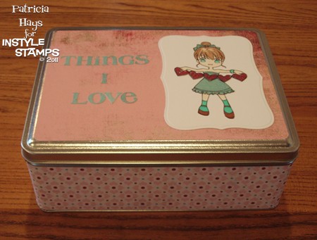
Here’s another photo that shows the side of the tin better, so you can see how the colors of the papers really do coordinate.  (Did I mention that I had a bad photography day when I was working on these projects?)

Thanks for looking at my projects today!  If you have any questions about them, feel welcome to ask in a comment!


In the spirit of full disclosure, the images used on today’s projects were provided to me by InStyle Stamps to aid in promoting their products.

My younger son is taking band now that he’s in middle school, and he plays percussion.  So when I saw this stamp at In Style Stamps, I knew I should make him a card with it.  Since he’s still somewhat interested in Pokemon and Bakugan, I thought he’d like the anime style image. 

Today’s card is the birthday card I recently made for him.  I used the current In Style Stamps sketch challenge layout, paired the image with a Stampin’ Up sentiment and chose some Basic Grey papers to go with it. 

My husband doesn’t usually say much of anything about the cards I make, but he told me that this one was “really good”.  I have to admit I’m pretty pleased with it, too.

Supplies:
Stamps: Travis (In Style Stamps); Birthday Whimsy (Stampin’ Up)
Cardstock: So Saffron (SU); Vintage Cream (Papertrey Ink); “Blue Bonnet”, “Matthew”, and “Nathan” papers from Oh Baby! Boy collection (Basic Grey)
Ink: Onyx Black (VersaFine)
Other: Premier colored pencils (Prismacolor); odorless mineral spirits (Houston Arts)

Today’s card is another one I created for Operation Write Home.  I thought one of our soldiers overseas might like to send it home to his or her son.  I combined two of In Style Stamps’ challenges for this one – the September color challenge for the color scheme and the October sketch challenge for the layout.  Even though I liked the original long, narrow layout of the sketch, I knew that reworking it into a 5.5″ x 4.25″ card would go easier for the OWH people.  The boy is a digital image, but the sentiment is a stamp. I had just the right size scrap of red print designer paper to cover the chipboard heart – I love when things work out like that! I added a little sponging around the edges of the heart.

Supplies:
Stamps: Everyday Sayings (Lizzie Anne Designs)
Digital Images: Jacob (In Style Stamps)
Cardstock: Creamy Caramel textured, Garden Green, Western Sky designer paper (Stampin’ Up); Basics White (Papertrey Ink)
Ink: Onyx Black (VersaFine); Ruby Red (SU)
Other: markers (Copic); heart die (Sizzix); chipboard; sponge

October is Breast Cancer Awareness Month, and in honor of that, Splitcoaststampers.com is offering up a month’s worth of “Hope You Can Cling To” challenges.  The cards created for the challenges will be donated to the UT MD Anderson Cancer Center to benefit those affected by breast cancer.  Since breast cancer touches so many lives, I plan to participate in as many of these challenges as I can to try to give hope or at least a brief smile to someone.

One of the challenges that was presented a few days ago was to make a card primarily using pink and brown.  I hadn’t yet made a card for the In Style Stamps September sketch challenge so I decided to combine the two.  I’ll confess that took the easy way out on the In Style challenge, though.  Although the participants were encouraged to make a T-slide card for it, I didn’t feel that I had the patience for it.  And since I don’t know who is going to end up being the sender or the recipient of the card because I’m donating it, I felt that it would be better to keep it simple and easy to send.  So I did a simplified, scaled-down version of the sketch to end up with a 4.25″ square card. 

This little Chloe image makes me smile.  I hope the person who eventually receives this card will smile, too.

Supplies:
Digital Image: Birthday Chloe (In Style Stamps)
Cardstock: Pretty in Pink, Close to Cocoa, Berry Bliss designer paper (Stampin’ Up); Basics White (Papertrey Ink)
Ink: printer ink
Other: Premier colored pencils (Prismacolor); odorless mineral spirits (Houston Arts); flower (Prima); mini brad, piercing tool (Making Memories); petite standard oval die (Nestabilities)

Last week In Style Stamps hosted a Birthday Bash challenge to help Operation Write Home celebrate their birthday.  Anyone who made a birthday card to donate to Operation Write Home and linked it to the In Style Stamps blog by Sunday afternoon (Sept. 26) would be eligible to win a great prize from In Style Stamps.  ISS was generous enough to even provide a free digital image called Birthday Chloe to use on the cards!  I thought, “This is GREAT!  I can get a super cute image to use on my card for the challenge, and just maybe I’ll be lucky enough to win the prize!” 

Unfortunately, due to circumstances beyond ISS’s control, there was a delay in getting the free image out to the people who requested one.  Birthday Chloe didn’t arrive in my email inbox until Friday morning.  Because of work, helping out with our high school’s marching band at Friday night’s football game and a competition on Saturday, and spending time with my family, I didn’t have a chance to work on a card until yesterday afternoon.  I was relieved to see that ISS had extended their original deadline… but then, I don’t know if I’d misread the information on their blog early yesterday, or what, but suddenly I realized I had only 50 minutes to make my card, photograph it, upload it online, and then link it to the ISS blog.  ACK! 

I’d already printed out the image and had a vague idea for my card layout.  Because of the time constraint, I knew I had to keep the color scheme pretty simple.  I don’t know why, but I felt a strong pull to use green on the card.  I hastily flipped through my Basic Grey papers and found a green floral.  I matched it to some SU cardstock, grabbed my Prismacolor pencils and started coloring.  I ran some Nestabilities dies through my Big Kick, assembled all the layers, and there it was – a simple, super quick 4.25″ square card.  I snapped a couple photos of it (literally – usually I take 4 or 5 photos to compare and upload the best), rapidly chose one of the two to use online, and uploaded it to my Splitcoaststampers.com gallery in a hurry so I could get it linked to the In Style Stamps blog.

I made it with 4 minutes to spare.  Whew!

Even if I don’t win the prize offered by In Style Stamps, the real winner here is Operation Write Home.  I’m happy to be able to help their worthwhile cause. 

And now, here’s the card.

Supplies:
Digital Image: Birthday Chloe (In Style Stamps)
Cardstock: Kiwi Kiss (SU); Basics White (Papertrey Ink); green floral print from LilyKate 6″ x 6″ pad (Basic Grey)
Other: Labels Nine and Petite Oval Nestabilities dies; Premier colored pencils (Prismacolor); odorless mineral spirits

Today’s card is my take on Lizzie Anne Designs sketch challenge #141.  I literally turned it upside down!  I decided to incorporate the circle elements into the stamped image, rather than using embellishments for them.  I hadn’t used my embossing gun for a long time so it was neat to play with that again.  Even after 8 years of stamping, I still think it’s really cool to watch embossing powder melt into an image.  OK, so I’m a goof.  LOL

The color scheme for this card is taken from the current InStyle Stamps InSpiration challenge.  I really like the look of the light blue and brown together so I focused on that aspect of the inspiration photo. 

And here it is.

lad-141-iss-aug10-inspiration.jpg

Supplies:
Stamps: In the Meadow, Treasured Trinkets (Lizzie Anne Designs)
Cardstock: Naturals White, Soft Suede, Soft Sky (Stampin’ Up)
Ink: Craft White (SU)
Other: twill tape, Hodgepodge Hardware (SU); white embossing powder (Stampendous)

We’re finally enjoying some cooler weather here this weekend!  According to The Weather Channel, the trend is supposed to continue through the next week.  It’s wonderful to have sunny days with temperatures only in the 80s. 

InStyle Stamps has been hosting a color challenge with some cool, refreshing colors that are just as nice as our weather.  Even though I don’t have any InStyle stamps (yet ;)) I wanted to play along.  I decided to go floral with a Stampin’ Up set I haven’t used for a while and some Primas.  I used a background stamp on the card base, but because I stamped it with VersaMark it’s very subtle.  I wish I could say that I came up with the layout on my own, but I can’t.  I borrowed it from a card at Splitcoaststampers.com

iss-aug10-color.jpg

Supplies:
Stamps: Artfully Asian, Linen, Hugs & Wishes (Stampin’ Up)
Cardstock: Cool Caribbean, Tempting Turquoise, Wild Wasabi, Very Vanilla (SU)
Ink: Wild Wasabi (SU); VersaMark
Other: flowers (Prima Marketing); half pearls (KaiserCraft); blender pen (SU); sponge

This summer I’ve been enjoying finding new blogs and sites and participating in their challenges.  I recently found yet another, In Style Stamps

I love sketch challenges because for me, figuring out a layout is often the most difficult part of creating a card.  So I decided to take part in the ISS sketch challenge.  This one had an extra twist – to turn the sketch into an easel card.  So I thought about it and finally came up with an idea.  I turned the sketch on its side because I felt my idea worked better that way. 

This card ended up being a mix of old and new stuff.  I’d never made an easel card before, but I found a really helpful tutorial online and figured it out.  I also hadn’t used this shape of Nestabilities dies yet and decided it was time to put them to use.  The patterned paper is from one of my oldest Basic Grey 6″ x 6″ pads; I’ve had it for a couple of years.  The cardstock for the card base is even older. And it seems like forever since I’ve used any of my stamps from eat cake graphics.  I used something else new to color the image – Copic markers that I received as an early birthday present from my husband.  I still have a lot of practicing to do with the Copics, but aside from my ink smudging a little bit, I’m pretty satisfied with my coloring job here.  I left the bottom panel blank so I can write a message to whoever receives the card.

I’ll admit that as I was working on the separate pieces of this card, I wasn’t liking it very much.  It felt like too much of a hodgepodge of things that didn’t seem to work together.  But now that the card is assembled and complete, I like it.  It’s still not one of my favorites, but I’m happy with it.  Sorry for the kind of dark photo.  It’s been trying to rain here all afternoon so I didn’t have a lot of good light for it.

iss-aug10-sketch.jpg

Supplies:
Stamps: Abagail’s too late for cake, Am I too late for cake, short present (eat cake graphics)
Cardstock: Mauve Mist, Kiwi Kiss (Stampin’ Up); Basics White (Papertrey Ink); papers from Gypsy 6″ x 6″ pad (Basic Grey)
Ink: Onyx Black (VersaFine)
Other: markers (Copic); Dahlia die (Nestabilities)

© 2019 Suffusion theme by Sayontan Sinha