hi there, puppy

Comments Off on hi there, puppy
May 212011

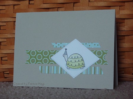
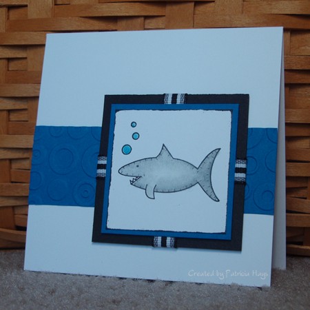
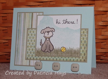
Just in the nick of time before the deadline, here’s my card for this week’s sketch challenge at Card Positioning Systems.  Their sponsor this week is Lawn Fawn, a stamp company I recently discovered.  Lawn Fawn offers some totally adorable images, and I decided to use them for my CPS card.

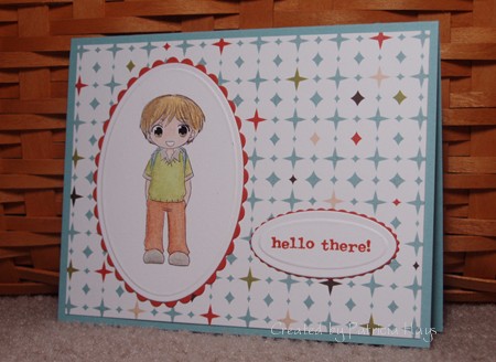
I wanted to make this a kind of boyish card for Operation Write Home.  I originally planned to use some brighter colors.  I have some red buttons I wanted to use, but I was having a hard time finding patterned papers that coordinated well with them.  On a desperate whim, I pulled out the Kioshi paper pad to try to find some masculine papers.  I liked the way these patterned papers worked together and I had buttons that coordinated with them. So I figured I’d go with this color scheme instead.  The striped paper is kind of a cheat on going masculine because the other half of that sheet of paper has a large spray of flowers!

Supplies:
Stamps: Critters in the ‘Burbs, Sophie’s Sentiments (Lawn Fawn)
Cardstock: Soft Sky, Mellow Moss (Stampin’ Up); Basics White (Papertrey Ink); papers from Kioshi 6″ x 6″ paper pad (Basic Grey)
Ink: Onyx Black (VersaFine); Mellow Moss, Soft Sky (SU)
Other: Mellow Moss buttons (SU); markers (Copic); sponge

Here’s another Birthday Chloe card.  I just think she’s darling.  This time I used the CPS weekly sketch for the layout. I decided to paper piece her dress and her gift so the card would meet one of the Hope You Can Cling To challenges at Splitcoaststampers.   

Supplies:
Digital Image: Birthday Chloe (In Style Stamps)
Cardstock: Pretty in Pink, Almost Amethyst, Tea Party designer series paper (Stampin’ Up)
Ink: Pretty in Pink (SU)
Other: Premier colored pencils (Prismacolor); odorless mineral spirits (Houston Arts); sponge; Small Labels die (Nestabilities)

It’s finally Friday!  Hooray!  It’s been a kind of busy week and my creativity is lagging, so today’s card is just a fairly simple one.  Once again I used this week’s CPS sketch layout.  This time I stayed more true to the sketch. 

This is my first attempt at coloring an anime style image.  It’s one that I was able to choose for free for winning the In Style Stamps color challenge last month. 🙂 (The other image I chose for free was shown in Monday’s post.)  I guess I didn’t do too bad with coloring it – then again, if it *was* bad, I wouldn’t be sharing it, LOL!  I know I need more practice with my coloring skills.

cps184-jacob.jpg

Supplies:
Stamps: Treasured Trinkets (Lizzie Anne Designs)
Digital Images: Jacob (In Style Stamps)
Cardstock: Baja Breeze, Dusty Durango (Stampin’ Up); Basics White (Papertrey Ink); “Alternative” from Offbeat 6″ x 6″ pad (Basic Grey)
Ink: Dusty Durango (SU)
Other: Premier colored pencils (Prismacolor); odorless mineral spirits (Houston Arts); petite oval and petite scalloped oval dies (Nestabilities)

Sep 132010

Did you like swinging on the playground when you were a child?  I always enjoyed it.  I remember sometimes I’d close my eyes and imagine that instead of swinging I was riding on the back of a pegasus, or being rushed up and down hills on a roller coaster, or soaring through the air with outstretched wings.

The image on today’s card brought back those fond memories to me when I saw it.  It’s a digital image called “Melanie” from In Style Stamps.  After I colored her, I decided to cut her out and adhere her to the floral paper, to make her look like she’s swinging among a bunch of flowers.  The top of the “rope” is attached directly to the floral paper, but the rest of the image is raised from the background with dimensional adhesive.  The layout is this week’s CPS sketch.  I thought the word stamp was an appropriate sentiment to put on this card, because doesn’t she look like she is having fun?

Melanie’s shirt and hair color are a little nod to my alma mater’s football team – the James Madison University Dukes, who came out with a very unexpected upset victory over the Virginia Tech Hokies last Saturday.  Go DUKES!

cps184.jpg

Supplies:
Stamps: Small Script (Stampin’ Up)
Digital Images: Melanie (In Style Stamps)
Cardstock: Baja Breeze (SU); papers from Kioshi 6″ x 6″ pad (Basic Grey); Basics White (Papertrey Ink)
Ink: Chocolate Chip (SU)
Other: markers (Copic); Hodgepodge Hardware (SU)

It recently dawned on me that I should keep a few belated birthday cards on hand for those occasional “oooops!” moments.  Today’s post is a quick and easy one I made last night.  I used this week’s CPS Sketch for the layout.  The sentiment inside the card reads, “I’m a little slow… happy belated birthday!”

cps180.jpg

Supplies:
Stamps: Party Animals (Lizzie Anne Designs)
Cardstock: Sahara Sand, Whisper White, Fall Flowers designer series paper (Stampin’ Up)
Ink: Onyx Black (VersaFine)
Other: Watercolor wonder crayons (SU); diamond die (Dies Direct)

I haven’t used this tree stamp for a long time.  It’s from one of my oldest Stampin’ Up sets.  I thought it would fit well with this week’s CPS sketch so I decided to dust it off and ink it up.  I added some sponging to the panel that the tree is on so it wouldn’t look so stark against the mat and the card base.  The only thing about this card that isn’t a Stampin’ Up product is the button, which was an extra that came with some article of clothing a long time ago and had stashed away. 

cps179.jpg

Supplies:
Stamps: Lovely as a Tree, It’s Your Birthday (Stampin’ Up)
Cardstock: Close to Cocoa, Always Artichoke, Very Vanilla (SU)
Ink: Close to Cocoa, Always Artichoke
Other: corner rounder punch, linen thread (SU); sponges; miscellaneous button

Sorry today’s post is later than usual being published.  Late last night I started on a card for this post, but I didn’t finish it until this morning.  Then I thought it looked like one of those projects that seems good when you’re a little sleep deprived late at night, but then the next day you look at it and start wondering “What was I thinking?”  Know what I mean?  LOL  I guess it’s not a bad card, but it’s not really my usual style.  But I think that card is going to wait for another day when I’m stuck without crafting time and need something to post. 

I originally planned to post this card on Thursday, closer to my mother in law’s birthday.  By then she should have received it.  So if she does happen to peek here before USPS delivers it to her, well, um, surprise! 

The layout for this card is this week’s Card Positioning Systems sketch.  I’ve been wanting to try this ruffled ribbon technique for a while, but because I had to mail the card, I didn’t want the ruffles to be too puffy.  So they are stuck down with glue dots pretty well.  I guess that gives the ribbon more of a pleated effect than ruffled, but for my first attempt, I thought it turned out all right.  This is sort of the “back side” of the ribbon. The other side is polka dotted but I thought that would be too busy with the designer paper, so I turned it over so the solid side would show.  

So without any further chitchat, here it is.

abh-birthday-2010.jpg

Supplies:
Stamps: Warmest Regards (Stampin’ Up)
Cardstock: Melon Mambo, Crushed Curry, Whisper White, Razzleberry Lemonade designer series paper (SU)
Ink: Melon Mambo (SU)
Other: Rich Razzleberry ribbon (SU); Ribbon Tags Trio die (Nestabilities)

I admit it – I like butterflies.  I confess that I bought the Basic Grey Ambrosia 6″x6″ pad mainly for the butterfly paper shown on today’s card.  When I received the Simply Sweet stamp set from Lizzie Anne Designs, I immediately adored the butterfly stamp – not just for the lovely butterfly, but also for the sentiment.  Sometimes I need to remember to just be me, and not what I think other people want me to be.

Today’s card brings those things together.  I used the CPS weekly sketch for the layout.  A couple retired Stampin’ Up In Colors coordinated with the Basic Grey paper. I used Prismacolor pencils with odorless mineral spirits to color the butterfly image.  It’s not my best coloring job because I was in a hurry, but I’m content with the way it turned out.

I hope you like the card. 

cps176.jpg

Supplies:
Stamps: Simply Sweet (Lizzie Anne Designs)
Cardstock: Marigold Morning, Dusty Durango (Stampin’ Up); Vintage Cream (PaperTrey Ink); “Winsome” from Ambrosia 6″x6″ paper pad (Basic Grey)
Ink: Chocolate Chip (SU)
Other: Chocolate Chip satin ribbon (SU); Premier colored pencils (Prismacolor); odorless mineral spirits (Houston Art)

Today’s card uses the same Lizzie Anne Designs sketch challenge layout as the card I posted last Thursday, but I used the mirror image of the sketch.  I didn’t want the shark to look like he was swimming off the edge of the card.  I realized as I was making the card that this is the first time I’ve used Stampin’ Up’s Pacific Point cardstock.  Why haven’t I used that color before?!?  (This is where you imagine me imitating Homer Simpson saying “DOH!”) I really like it with the black and white and grey here. 

I kept CAS-tastic challenge #12 in the back of my mind as I was creating this.  The challenge requirements were to use at least three of the following things to keep it SIMPLE:  Stamped (or digital) image; Inked edges; Masking; Paper piercing; Lace; Embossing.  The shark is my stamped image (kind of obvious, huh), I inked the edges of the shark image panel with black ink, and the long Pacific Point panel is dry embossed with the Cuttlebug “Spots & Dots” folder.  The embossing made the card eligible for the CAS weekly challenge at Splitcoaststampers.

This is going to be a birthday card.  The sentiment inside reads, “Have a KILLER birthday!”  I thought with the image it’s pretty cute!

cwc012-lad134-cps175.jpg

Supplies:
Stamps: Simply Sweet (Lizzie Anne Designs)
Cardstock: Basics White (PaperTrey Ink); Basic Black, Pacific Point (Stampin’ Up)
Ink: Onyx Black (VersaFine)
Other: Spots & Dots embossing folder (Cuttlebug); ribbon (May Arts); Premier colored pencils (Prismacolor); odorless mineral spirits (Houston Art)

© 2019 Suffusion theme by Sayontan Sinha