Hopefully today’s card will lighten the “down” mood of my last couple of posts. I think the bright colors and the butterflies will do just that.
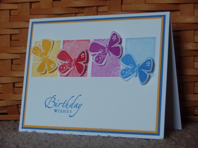
This is the birthday card my family sent my mother-in-law this week. I got the idea for the color scheme from my old Stampin’ Up! Fiesta spectrum pad. I stamped off the blocks twice on a scrap piece of paper before stamping them on the cardstock. Cutting out the butterflies was a bit of a faff, but I really like the 3-D effect I achieved by slightly bending their wings.
I didn’t realize it until I was watermarking the photo, but this card does a good job of comparing two different brands of white cardstock. I used Stampin’ Up’s Whisper White for the top layer of the card, and Papertrey Ink’s Paper Basics white cardstock for the card base. There’s definitely a difference in the white-ness. Can you see it too?
Supplies:
Stamps: Priceless, Sincere Salutations (Stampin’ Up!)
Cardstock: Whisper White, Summer Sun, Ballet Blue (Stampin’ Up!); white Paper Basics (Papertrey Ink)
Ink: Summer Sun, Real Red, Marvelous Magenta, Ballet Blue (Stampin’ Up!)
Other: Stamp-a-ma-jig; Cutterbee scissors
2 Responses to “To brighten things up…”
Sorry, the comment form is closed at this time.


A bit of a faff?????? Worth it though – looks fab!
Gorgeous