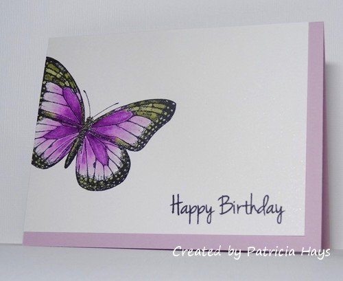
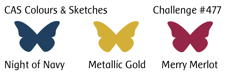
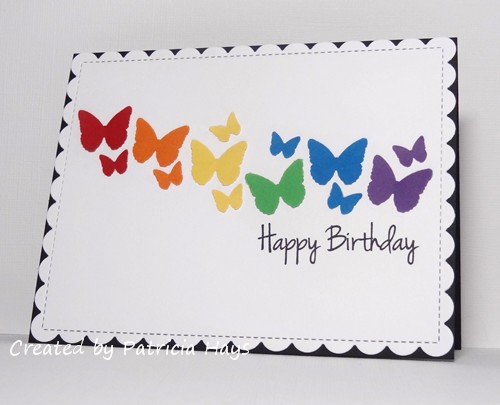
Hello there! Today’s card is for my aunt, who is turning 80 years old today! I wanted to send her a card with something more sophisticated than party hats and cute animals, but looking back through my saved photo files I realized I’ve sent her a LOT of cards with flowers. So this year I decided on butterflies.
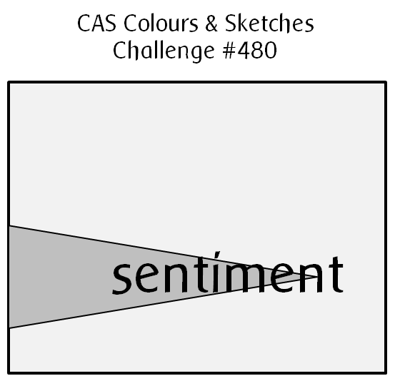
I browsed through some of the various online cardmaking challenges and realized that I could combine a few of them for this card. I’ve used the AAA Cards sketch again (the same sketch I used for the card in my last post). The Paper Players is asking folks to use “black, white, and a bold pop of color”. It didn’t say whether or not the bold had to be just one color, so when I saw that the AAA Birthday challenge was to use a rainbow of colors, it seemed like that would tie in for something bold.
I punched a swarm of butterflies from six of the colors of the spectrum. (Sorry, indigo.) I die cut a card front from white cardstock and arranged the butterflies across it, following the sketch. I intentionally glued down only the left side or only the right side of some of the butterflies, so that the unglued wings could pop up for a little bit of dimension. I added a sentiment in black, and adhered the panel to a black card base. Ta-da!

And there you have it! I hope my aunt has a wonderful birthday! Thanks for stopping by my blog today! Comments are always appreciated.
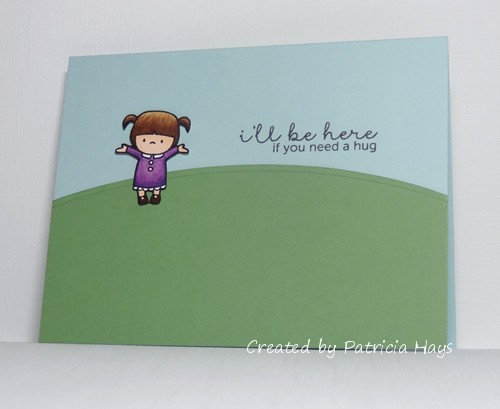
Supplies:Stamps: Birthday Greetings (Gina K. Designs)
Cardstock: Real Red, Pumpkin Pie, Daffodil Delight, Cucumber Crush, Pacific Point, Eggplant Envy, Basic Black (Stampin’ Up); Solar White (Neenah)
Ink: Onyx Black (VersaFine)
Other: butterfly punch (Martha Stewart Crafts); Outside In Stitched Scallop Rectangle die (Lawn Fawn)